I split my time between art & user experience design, where I consult through my business name Make It Legit. I picked that name for a blog that I started years before I ventured out into the freelancing/consulting world. I was a full-time salaried product designer at LinkedIn (after nearly a decade previously at Adobe) and one good side effect of working there was that everyone was pretty open about personal career discussions.
Motivations
For years I’d been bothered by the way interaction/UX design got conflated with the visual/UI work, and how visual/UI work got conflated with art. Or, in short: how there was an outsized emphasis on pretty-looking portfolio pieces. I was well-versed in making these (especially with my Photoshop experience) but they tell very little about the skill of a designer.
Did they make it alone, or did other designers work with them on that? Were they using parts given to them by a design system? Who’s the intended user, and does this work for them? What are the expected workflows, and how do they handle anything besides the “happy path”? How did this meet business goals? What was shaped by the technical decisions? What feedback did they get from users about concepts? Or implementation? What other tools or products does this depend on?
Or, more often than not: was this even real? Was it implemented? If not, what did implementation look like? How would they approach it differently, knowing what they know now? There are many simple tools now for creating beautiful portfolios, prototypes, and mockups that are a distraction from the true capabilities of a designer. That bothers me.
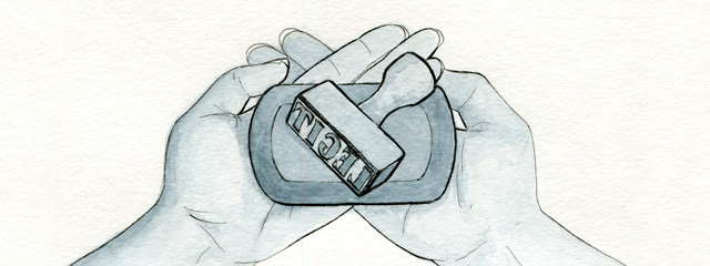
So I started writing blog posts about those capabilities from a process, design, user, team, and career perspective. I don’t write for fun, and while I felt motivated to get these thoughts across, I found the writing exhausting. So I came up with a way to stay motivated: create a watercolor illustration to accompany each one. I’d save these as the last thing to create, to be my reward for finishing the writing.
Process
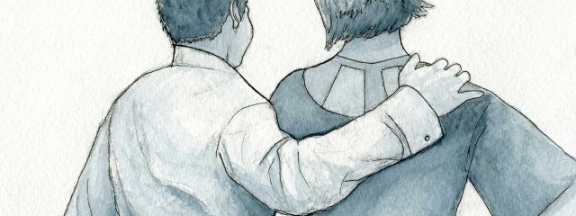
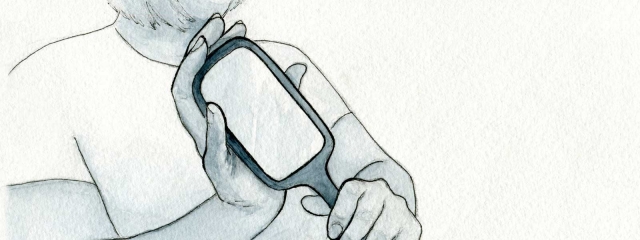
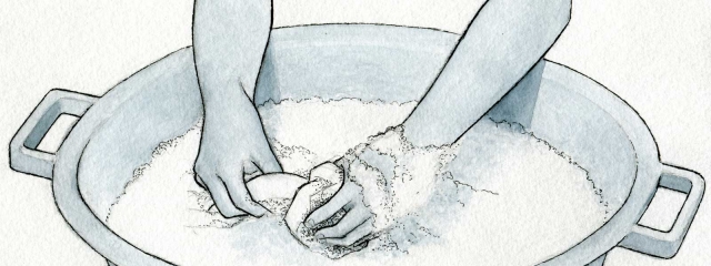
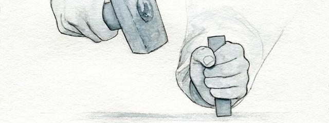
I decided to reinforce the “maker”-style theme by creating illustrations of people doing things. I was heavily influenced by illustrations for the articles on A List Apart (especially the watercolors). I’d look through photo references with CC0 licenses and also take photos of me (or enlist Alan) to get particular poses.
In hindsight, watercolor-texture paper does not translate well to direct digital capture because it’s a little yellowed and bumpy. I could probably do them digitally but it’s not quite as satisfying to me yet. Maybe it will be in the future.
Illustrations
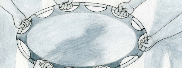
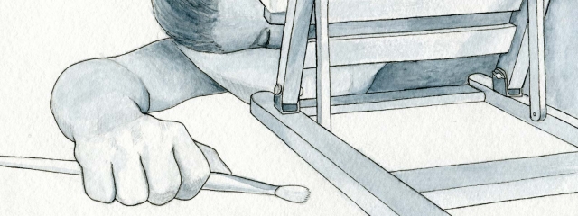
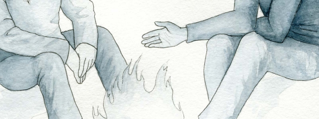
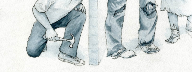
The illustrations are below, and you can browse the posts themselves in these categories:











Leave a Reply