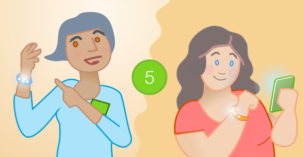
Just finished a fun project: creating customer journey maps!
Though normally there isn’t much crossover between my artwork and my experience design work, this project fell squarely between the two. I learned a lot while doing it, and the output is fun…so here’s a glimpse at what I created and why. I recently worked with Weight Watchers to distill extensive research into a high-level story about what happens when people sign up for the program. Director of design Vlad Margulis, researcher Paige Bennett, and I worked together to describe the process – which spans a website, in-person meetings, and a mobile app – into one continuous experience. We used personas, spreadsheets, and service blueprints to craft a story with 16 distinct steps.
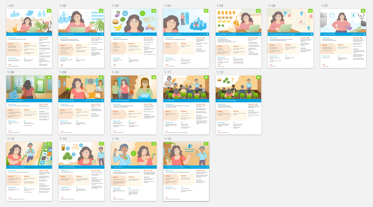
There’s a bunch of info folded into each step:
• Context cue (upper right): interaction context of browser/phone/in-person
• Step (blue bar): what happens here & additional communication that may happen from that point
• Customer point of view: their goals, what action they take, and what outcomes they should have
• Business point of view: their goals, key performance indicators (KPI), and what teams (or “crews” here) are involved
• Opportunities/Pain Points: specific issues to address in designs and/or systems

The bulk of this is design work, so why use illustrations? With such rich detail about the logistics, the illustrations provide one coherent story arc. It not only shows how one interaction led to another, but also provides insight to the emotional cues: the uncertainties, the curiosities, the victories. It can give a sense of the environment and potential distractions as well.
This project was particularly well suited for this kind of activity due to the variety of environments and people that are a part of it. Here are the qualities I’ve found to make these kind of illustrations lively and effective.
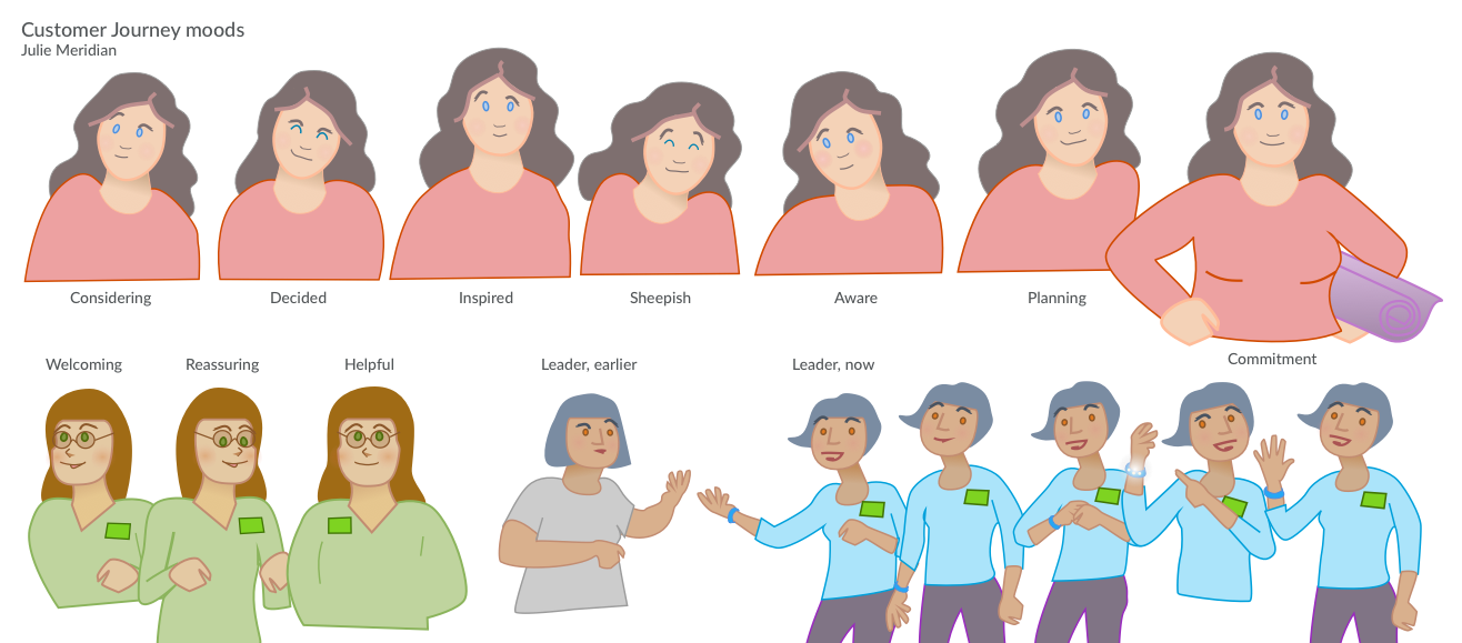
Expression
Both the facial expression and pose can speak volumes about what’s on a person’s mind. Eyebrows, shoulders, and overall angle can go far in showing reactions, even with stick figures. I reused drawings of “Jennifer” many times with these small adjustments. When Jennifer’s contemplating something, I have her raise her right eyebrow just a bit higher than the left; asymmetry always looks more natural.
Closed eyes can help reinforce contentment or frustration. On one drawing, I added a little extra blush when one of her fears is addressed. For the meeting portion I introduced Jennifer’s purse as an additional cue about how she feels. The way she holds/interacts with it changes over time as a signal about how comfortable she feels.
Meaningful colors
I started off with more muted tones and made them more vibrant as the story progresses. I also picked a few key colors to make it easier to spot particular items of note. Pink/salmon is Jennifer’s color to help keep the focus on her throughout the story. Green is a cue about the environment she interacts with: from her laptop, to the chairs at the meeting, to her mobile phone. Blue is a cue for Weight Watchers itself, which I used when Jennifer compares plans and imagines what it will be like, and reinforced by the book she receives and the meeting leader’s attire.
Varied layouts
Seeing the same layout step after step can present a quiet feeling, one where not much is happening besides the passage of time. If this is what you want, great! If not, it’s worth varying the size, layout, and/or angle of characters to keep it fresh and prevent them from feeling wooden or lacking emotion. There are three types of layouts I like to use to switch things up.
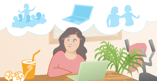
Environment
These are great for establishing shots before getting into details. I also started with one here with a thought balloon to contrast what Jennifer’s thinking about (“what plan should I choose?”) with a reflection of where she’s starting from for food and fitness.
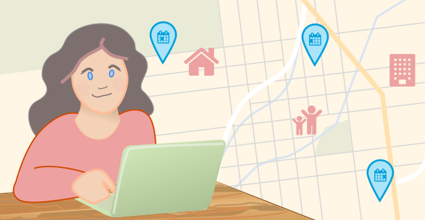
Over-the-shoulder
It’s handy to see both the person and the thing they’re looking at. In this case, it was more important to see her facial expression and pose than how she was specifically interacting with her laptop or phone. What she sees – the screen – takes the place of the background. It’s what she’s focused on now, after all. I also kept with a cartoony style here to avoid prescribing what the interface itself should look like (and also wanted to indicate locations that matter to her: home, work, daycare).
Cause and effect
I like to use a squiggly line between two things to show different points of view. Since I can assume the team I’m creating this for reads English, I can rely on a left-to-right visual parsing of what I draw. It usually doesn’t take much beyond that, though if it’s a trickier visual progression, characters can look or gesture towards the direction you want readers to see next. If all else fails there’s always arrows, but it’s a fun layout challenge to make it work without them.
Character illustrations can lend a lot of richness to understanding what’s happening with people, and any fidelity will do if you take a little care to keep them lively. I highly recommend using a vector drawing tool so they’ll look good when printed, and you can go far with simple transforms. Draw on!
Marjan
Dear Julie,
Really informative article!
I would like to look at your customer journey map up close, but can’t enlarge it properly. Could you help me with this? It looks amazing but can’t read the text.
Thank you!
Kind regards,
Marjan P
Julie
Thanks Marjan P! I’ve updated this to show one of the steps in detail and describe the types of information in it.