
GOACHE ON TRANSPARENT FILM & ACRYLIC ON PAPER • 12” x 9”
original art commissioned by James K.
Like this idea? You can commission your own original art too ⇢
I’ve been wanting to try this style for a long time! My friend James hired me for a commission for Lea Ann’s birthday that was the perfect excuse to do it.
Drawn towards animation
Like many kids that drew, I enjoyed drawing the characters from comics and cartoons (to varying degrees of success). I paused cartoons and drew what I saw, and also sought out books that had them in them – though since I quickly got tired of the key art that got used on merchandise everywhere, I went digging for more useful references.
I learned about the basics of how animated characters are drawn (squash & stretch and all that) as well as the process (keyframe sketches, in-betweening, inking, and painting the back of the cel). I started tracking down the model sheets for animators to show how to draw (and how not to draw) characters. I also found auction catalogs of production cels from feature-length movies to just see more of them. Later, I found that anime was a good source of affordable animation cels and bought original cels from series I’d never seen just because they looked cool (like Hyper Police) and some from series I loved (Real Ghostbusters!). I love them as art artifacts, and to be able to hold and see both the cel and (sometimes) the painted background created for that scene. They’re quite special to me because they were created by artists and are one of a kind.
That said: I don’t have the drive or rigor to make an animated film. They are an astounding amount of work. However, I really wanted to paint my own cels and backgrounds.
The idea
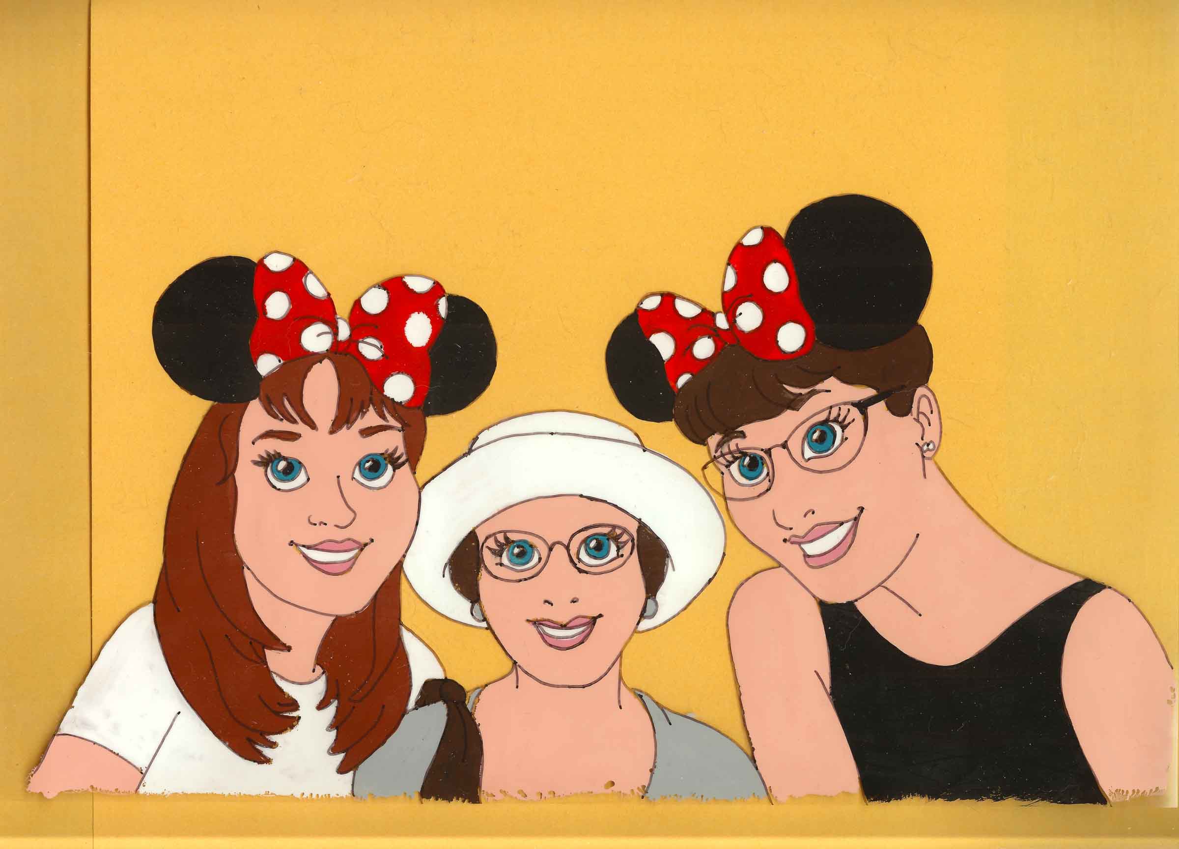
James came to me with a request: he’d gotten two original Disneyworld tickets (from when rides took A-E tickets) and wanted to give those to Lea Ann framed alongside a painting of her with her sister & mom at Disneyworld. And: have the Disneyworld logo in there somewhere.
He left it up to me to suggest how to do this. I knew I needed to plan out the total layout first, which sounded to me like a frame with them mounted in a custom mat. The painting could have been any style, but while thinking along the lines of framed memorabilia I realized this could work really well with an animation cel-style portrait. That was extra relevant since the theme here was Disney. He was game for this “let’s make them look animated!” suggestion. I made a rough digital mockup of how’d they look animated to be sure that worked out for him, and a few options for the frame layout (since cels are made at a particular size that I wanted to match). Once he picked one, I put in the order for the frame immediately as it was a custom size that would take weeks to arrive.


Making it work
The overall idea was a go, and James asked for a couple of changes: make the Sleeping Beauty castle more prominent, and put Lea Ann and her sister in Minnie Mouse ears. Easy enough! I mocked it up to confirm that and then moved onto logistics.
I knew how cels were painted but didn’t have the materials, so after some research and forum-searching I acquired these:
- Clear acetate-alternative sheets (9×12) from Graphix
- Gouache paints in an animated-style light/Caucasian tone (aka peach-ish) (I already had other colors)
- A black ink recommended for linework (I disagree and am linking only as a caution)
I sketched them on tracing paper mostly for tradition’s sake, as that material is used as a way to see and flip through animated frames to get the motion right (“onion skins”). Before I put the cel on top to ink it, I thought I’d better do a test run of both inks and the paint to get familiar with how it behaved. I am very glad I did this before working on the real deal.


I tried that Higgins ink along with four other markers in my stash to see whether the linework looked right, and whether it would hold up. I needed something quick and easy to draw and was in a traditional animation mindset, so I did a hand reaching for an apple as a little homage to the first feature-length animated movie (Snow White). I accidentally smudged the first ink after drawing it and realized that was a good test, so I let it sit for a few hours to get properly dry and then ran my thumb across the forearms. This was an instant disqualifier for a few inks including the Higgins (@#$^%@). Most had lines that were too chunky. The one that held up and actually looked right to my eye, compared to real production cels, was an ultra-fine point Sharpie. I’m mildly surprised about that.
The paint was another surprise. After giving the ink a day to dry, I flipped it over to paint in the parts (this is how the lines always look good; all painting it on the reverse side). This meant paying attention and painting the highlight of the apply first. As I painted it, the paint didn’t want to stay together. It kept separating, and I found I had to glop on more paint than I expected to get a nice solid color in the areas I wanted. Good test. I set my test aside, and maybe a week or two later moved it when one of the test hands had slightly stuck to a paper below it and immediately peeled off. Another cautionary note: make sure that paint is completely utterly bone-dry, and don’t leave it paint-down anywhere until final assembly.
Painting the cel / painting the background
This was the fun part! I alternated between the cel and the background depending on my mood, or whatever was dry.
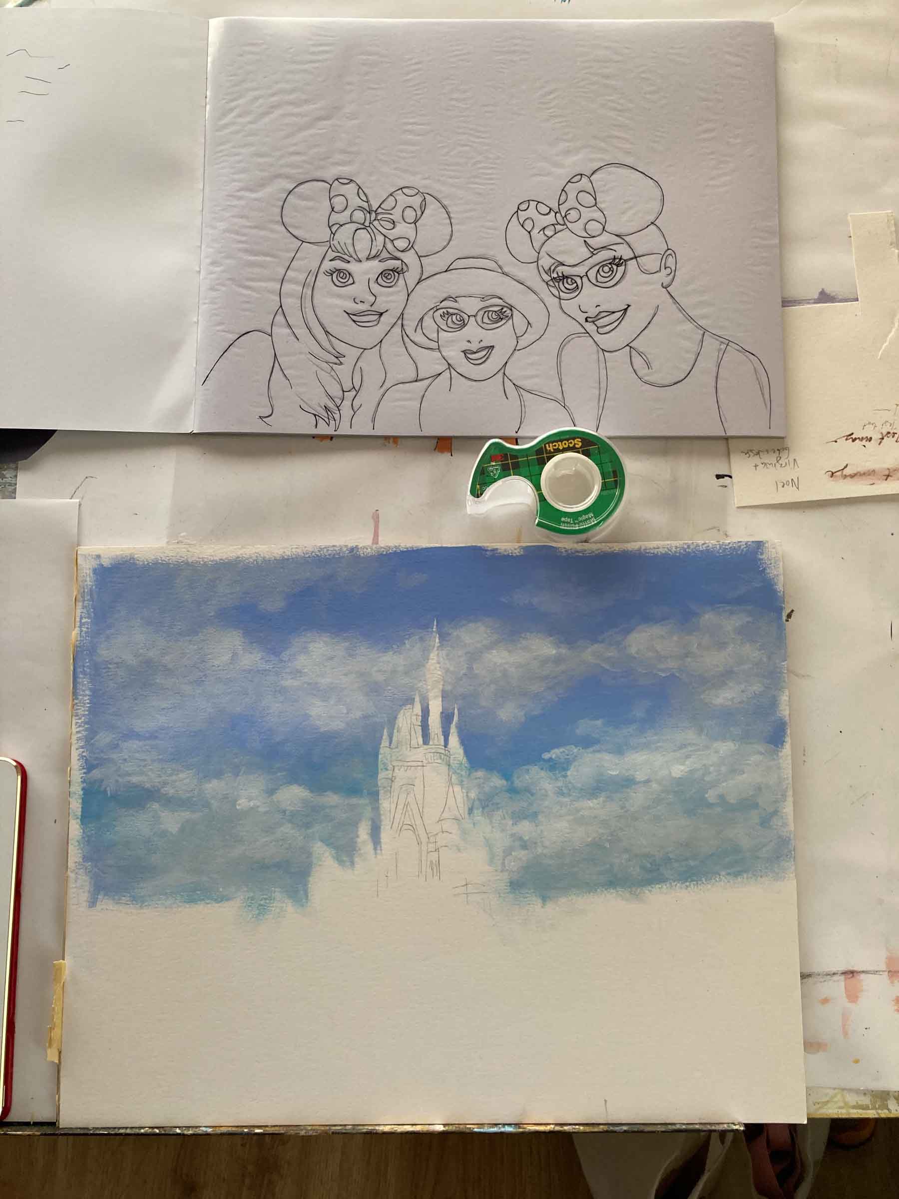
After I’d sketched out the pose initially (the first image below), I decided there were a few things I wanted to fix in it so I drew a fresh one to work from (the second image). Inking the cel took the most precision so I did that first. Once that was done, I felt much more confident about the rest. I came back to painting it after a few days (let that ink dryyyyyyy), planned my order of colors (don’t screw up and forget to paint the highlights first!), and painted each one across the whole thing (peeking at the other side occasionally). My nemesis, the separating paint, kept happening but I got better about using very thick paint and also accepted that I could come back and fill in areas that didn’t take (the saving grace of a flat color). After I’d had it all together, I thought the linework looked a little anemic so I carefully traced it to thicken it slightly.
For the background, after I sketched it out in pencil, I focused on the sky first so there’d be a cheerful blue sky and poofy clouds. Animation backgrounds are usually either simple and crisp, if it’s more architectural, or loose and gestural. I decided to go more crisp on the castle and more gestural for everything below it to look like a blurry crowd. Once I thought I might be nearly done, I looked at it with the cel on top and then corrected for any detail (or lack of it) that was distracting.

Finishing the layout (and a little logo work)
Now to bring it all together. We picked the side-by-side layout where the cel is on the left, and the tickets are stacked on the right with the logo in between. I considered cutting the logo out of a sparkly mylar. Ultimately, I decided it would be too distracting, and I wasn’t confident I could get it looking right at such small detail. Instead, I used the special 50th Anniversary Disneyworld logo that James liked, and since I could only find a JPEG online I recreated it in Illustrator for properly crisp vectors. That also gave me a moment to think about the colors more and I opted for a cream-to-pink gradient to help the ticket-logo-ticket stack look like a more unified set.
Last but not least: mat colors. Being able to cut my own mats is especially helpful for custom work like this. I put together a few options based on the colors I had so James could pick one. Someday I’ll graduate to being able to make my own frames too, but for now, I do fine with custom online sources and happy thrift store finds. Mats are for fit and finish, and like a rug, they really bring the whole thing together.
That’s it! I’d love to make more animation cel portraits.


Leave a Reply