ACRYLIC ON CANVAS • 28.125” x 34.125” framed
$1400 • Email julie@juliemeridian.com to buy this artwork ⇢
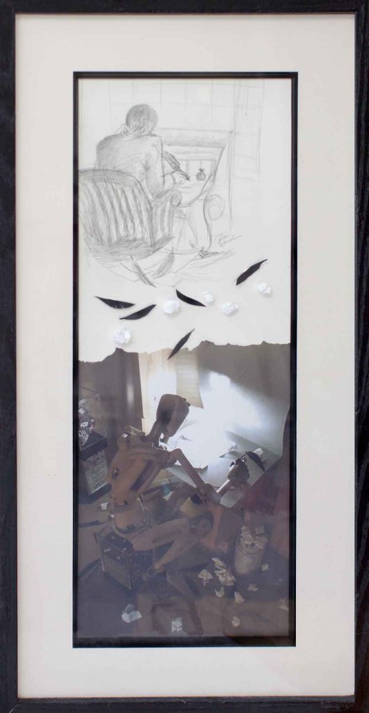
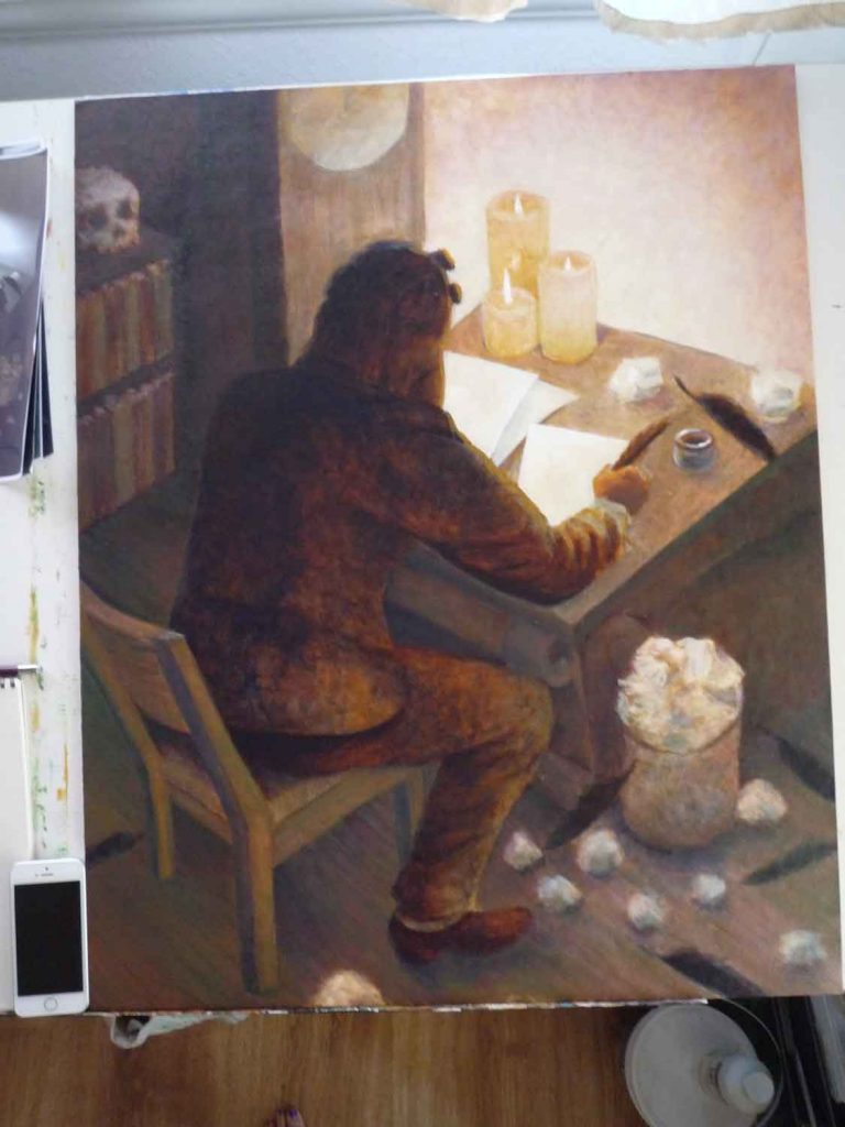
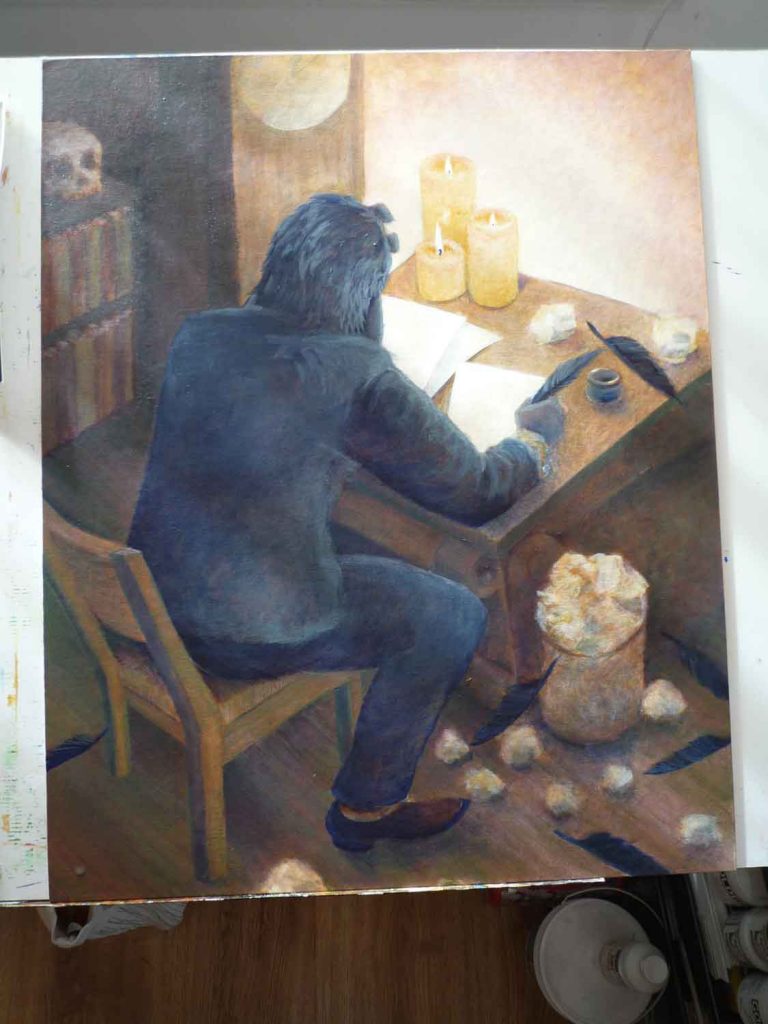
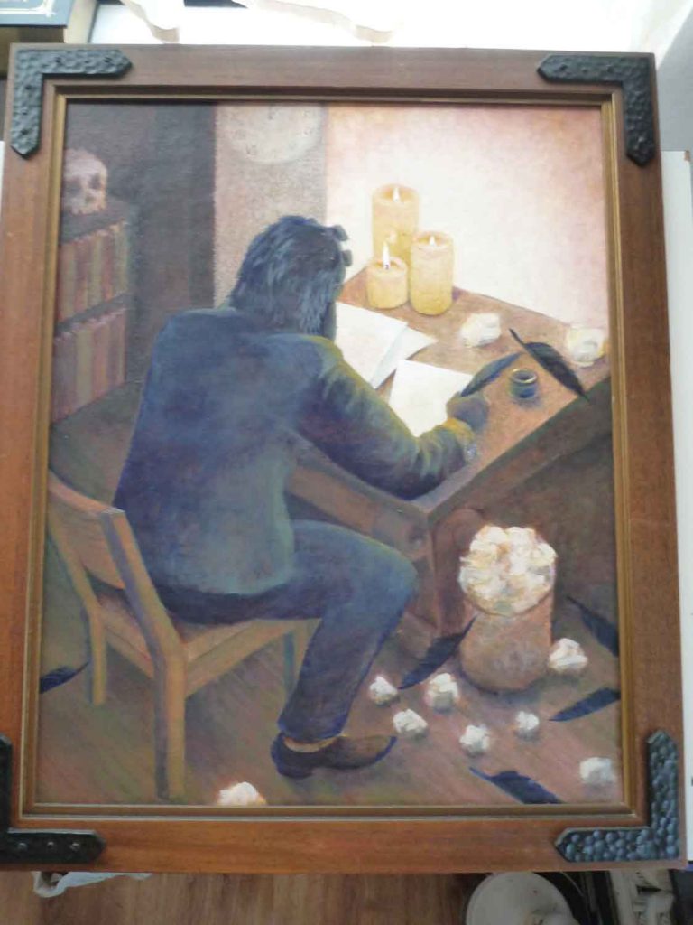
This moody piece came together from many different sources. I found this gothic (or possibly medieval)-looking frame at a Goodwill attached to a beaten-up print from JCPenney. Around the same time, I was working on a UI design that needed sample content and had picked the phrase “Why is a raven like a writing desk?” to use. It occurred to me that both this Alice in Wonderland riddle and Poe’s poem “The Raven” reference the same themes: writing, ravens, and a touch of madness. I envisioned a frustrated writer toiling in the late hours by candlelight – a good fit for the heaviness of the frame.
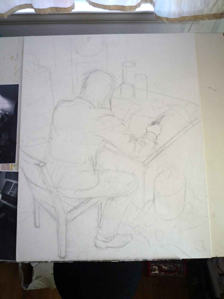
While making the initial sketch, I decided it would be interesting if the writer was himself a raven and was using his own quills to attempt to write. I liked the idea of arranging the pose so this wasn’t obvious at first, but a closer look at the back of the head would look more like feathers than hair, and what could have been seen as the arm would actually be a beak.
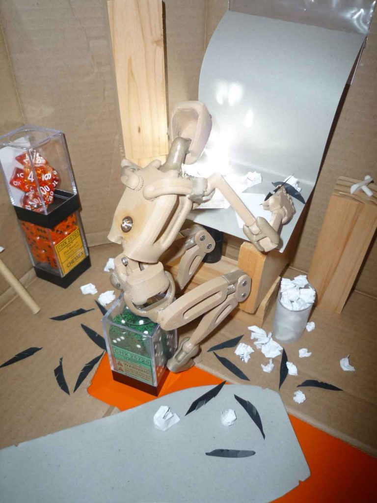
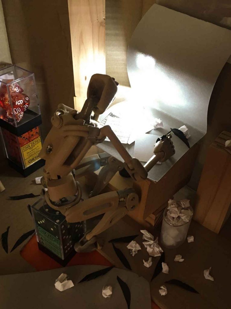
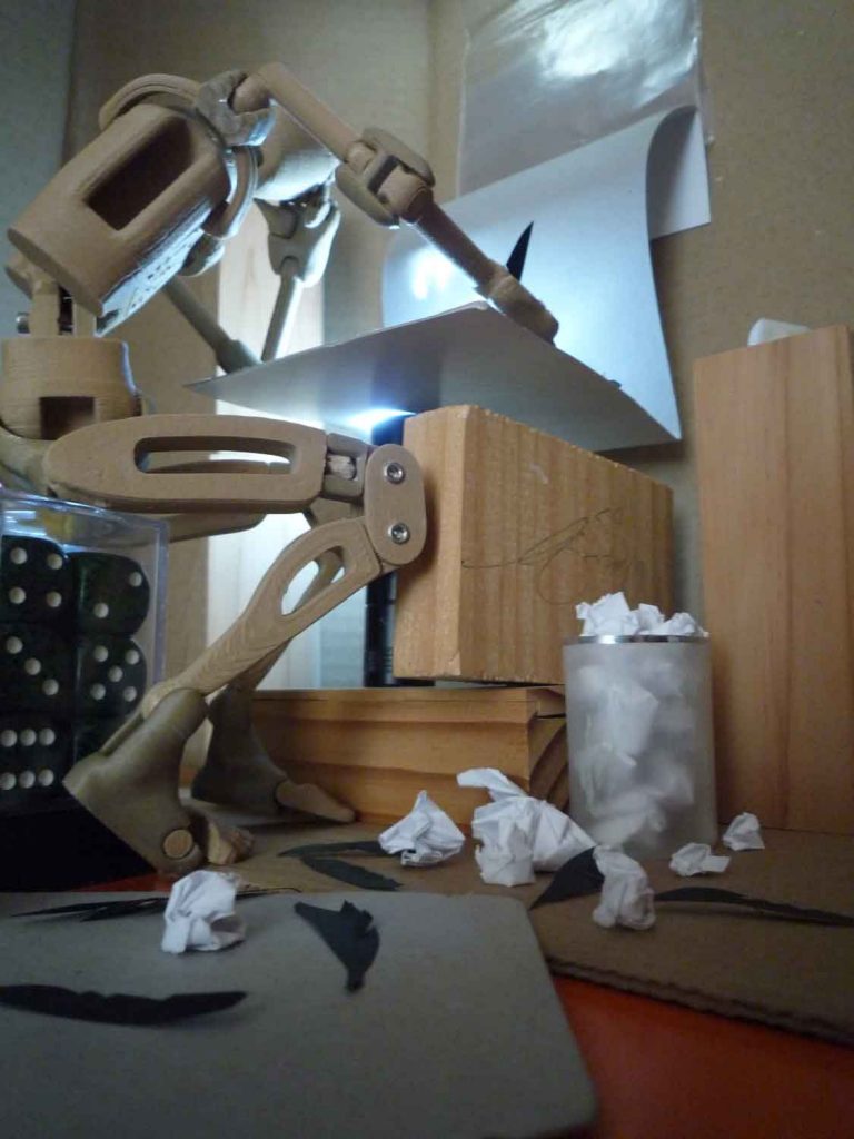
I gathered up dozens of photo references for desks, candlelight, and ravens, but I knew it’d be tricky to get the perspective, pose, and lighting right without a proper mockup of the full scene. I briefly considered getting a 3D program to set up a scene and ultimately decided it would look too artificial. Instead, I built a scene out of a shoebox, a tiny flashlight, a 9″ posable model (the excellent A9 Ranger from Digital Double), a few odds and ends, and lots of paper and cardboard. After taking about 50 photos from every conceivable angle, I whittled it down a winner and enlisted my husband and frequent model Alan to mimic the pose for additional clothing/lighting reference.
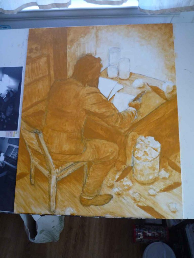
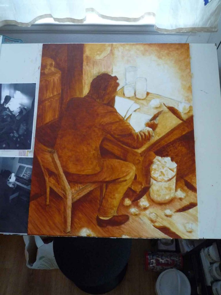
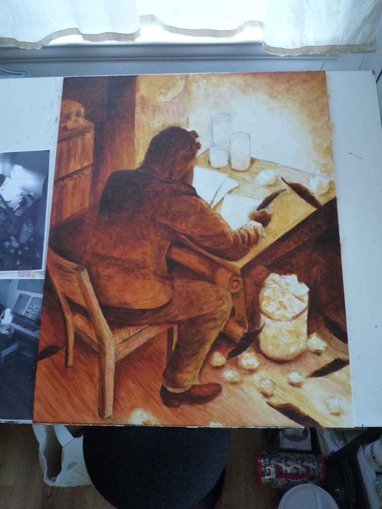
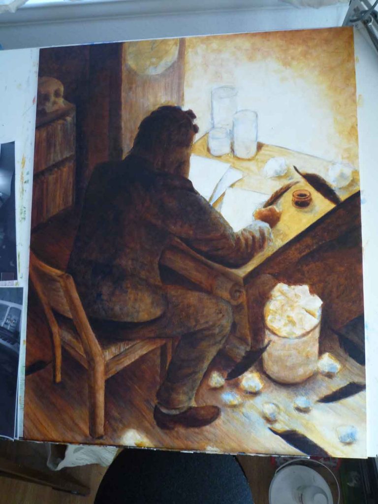
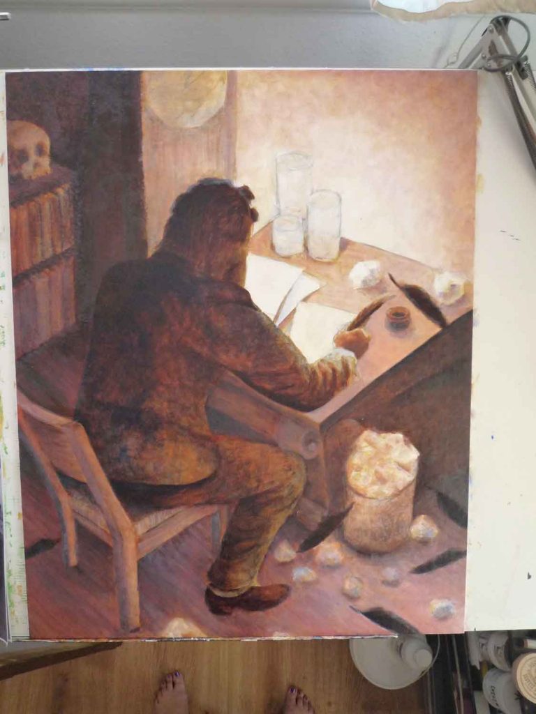
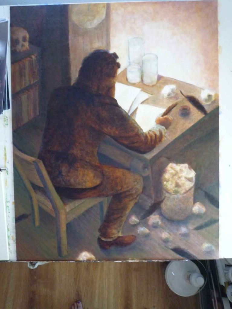
The frame is pretty shallow so I tracked down a 24″ x 30″ canvas on panel for the painting. The beginning process was pretty similar to my other paintings. I’ve come to realize that after my tone layers & ultramarine blue, I often go to either greens, purples, or whites as the next few layers. These are usually the ones that start bringing individual areas much closer to a finished state. I also set the frame around the painting in the later stages to make sure the tonal range matched.
Like previous paintings, I’d restricted myself to using ultramarine blue for the dark areas initially; it, combined with burnt umber, can often make a rich and interesting dark color (to see this in action: every painting in the Statement series uses this blend except Statement III, which uses a carbon black for the helmet and jacket to make it stand out). Near the end the overall tones still looked a bit too soft, so I browsed through paintings of candlelit scenes for inspiration. This helped me shore up the candles, and this painting by Pehr Hilleström in particular made me decide to use carbon black to make the figure and feathers stand out.
The back of the painting is papered over with a copy of Edgar Allen Poe’s poem. I ended up leaving out references to “Why is a raven like a writing desk?” but will leave you with the solution I’d come up with and still prefer most: because they both have inky quills.


Julie Meridian
I recently discovered another poseable figure that might be of interest for anyone seeking these out: https://www.indiegogo.com/projects/stickybones-rapid-posing-animation-made-easy–3#/ It’s the same size as the A9 Ranger but cheaper. It looks like the range of motion is a tad different (love the movable clavicles on the A9!) but it might be a better choice for frequent pose changes for stop-motion animation.