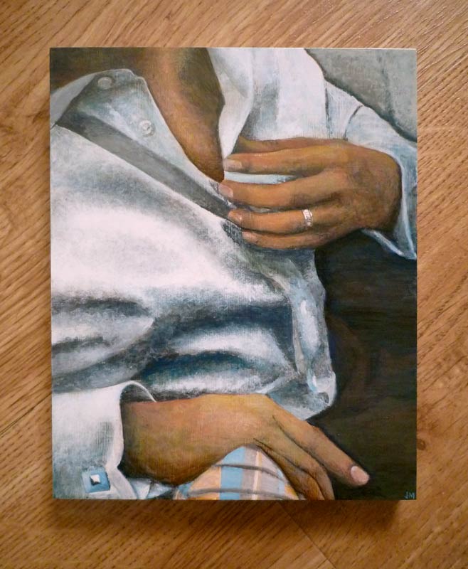
ACRYLIC ON CLAYBORD • 10″ x 8″
Prints available • Email julie@juliemeridian.com to buy prints ⇢
I’m starting a series of paintings to explore two things I’ve wanted to work at more: figures and fabric. I’m always drawn towards art that has people in it, especially people with a distinct mood. I also wanted to build up more technical skill in drawing/painting fabric with realistic weight and drape. I’ve been paying more attention to white walls/fabric in particular to get more attuned to subtle influences of light color and soft reflections.
After some thought I’m going with the name “Statement” for these. I’m looking for poses that communicate a point of view, and I’m challenging myself to not rely on facial expressions if at all possible. It’s also a nod to the role of fabric: not just a thing for comfort, but a thing that reacts to our shapes and reflects our stance.
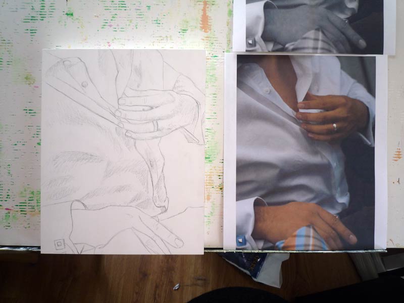
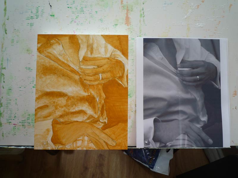
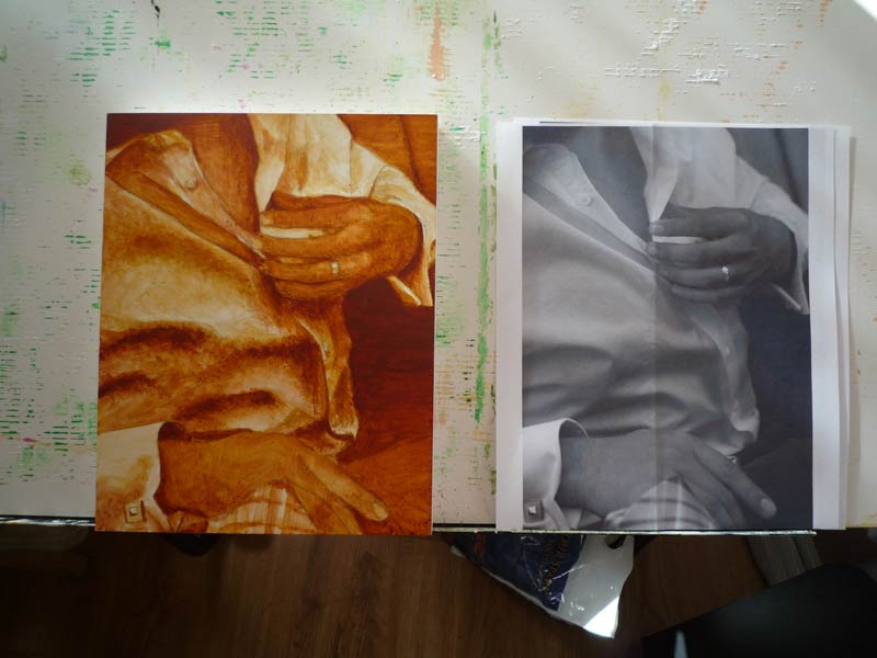
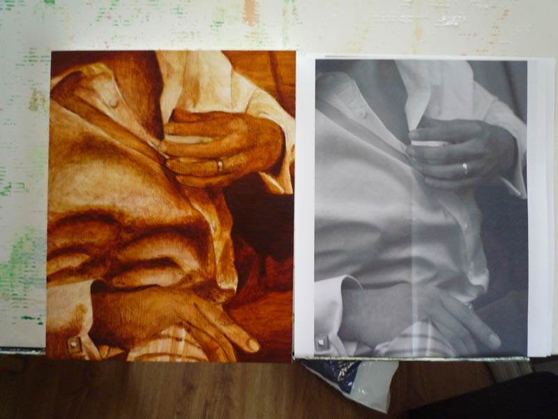
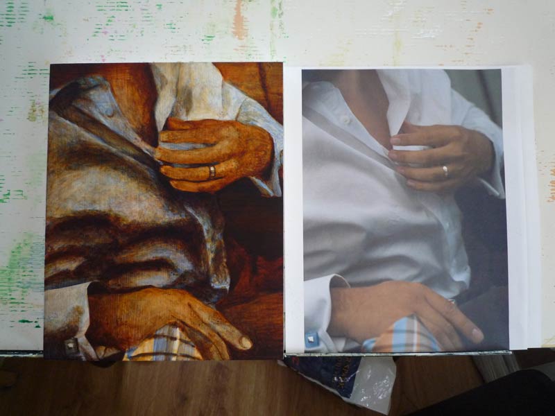
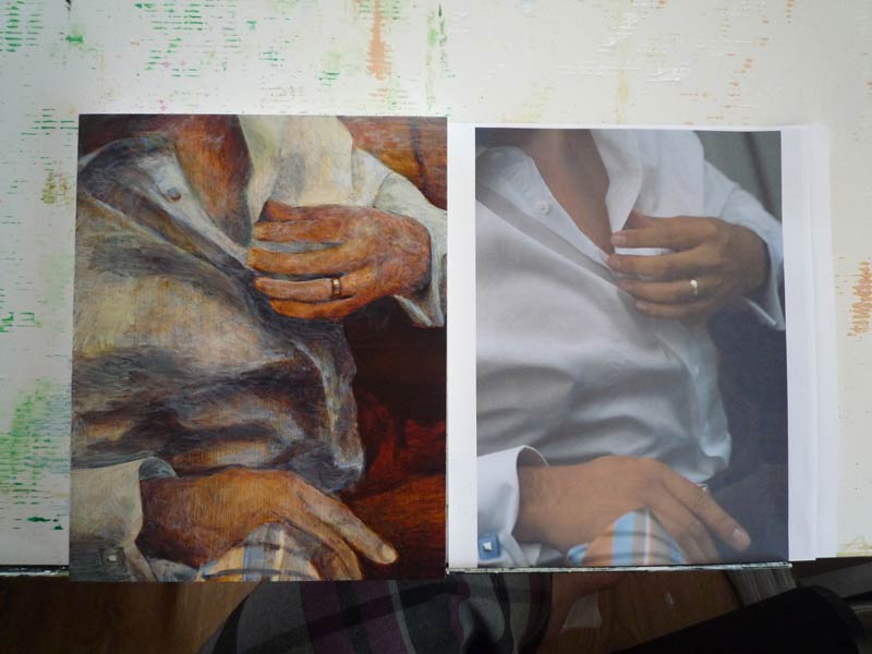
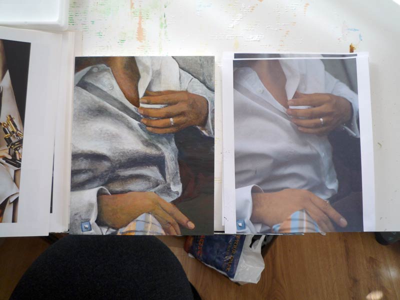
This one is the result of a collaboration with a talented photographer friend, Jillian of Epoxy Studios. She recently took headshots for Alan, and they were good sports to try some artsy poses that I could paint. I really liked the balance of this image.
I’m also trying out a new surface: a smooth masonite-like board called “claybord“. I don’t particularly like the texture of canvas, so this is a nice change. It’s smoother than I’m used to, which is both good and bad. The paints seem to dry much faster on it too, which can be challenging. Overall, I like the size and how solid they are.
The fabric was particularly challenging. Two things in particular helped:
- I resorted to the old “turn it upside down” trick. This is an excellent way to sort out things that just aren’t looking right. Turning the image upside down, sideways, or even just looking in a mirror can reveal which parts are looking off. I’ve also noticed that sometimes just taking a photo of it and looking at the tiny thumbnail on a screen can do that too.
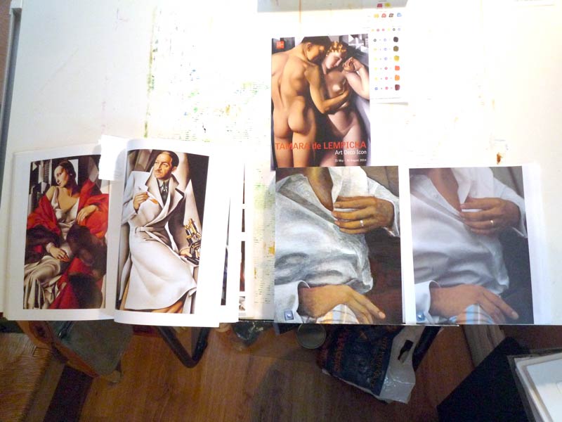
- Right when I was at the lowest point with this, Alan pointed out that the image looked a lot like paintings by Tamara de Lempicka. That hadn’t occurred to me when I picked this, but he’s absolutely right. I referenced a few of her paintings as I worked through this, making the fingers a little more cylindrical and looking at her fabric gradients for reference.
I’m looking forward to more paintings in this style, hopefully with a range of people.

Leave a Reply