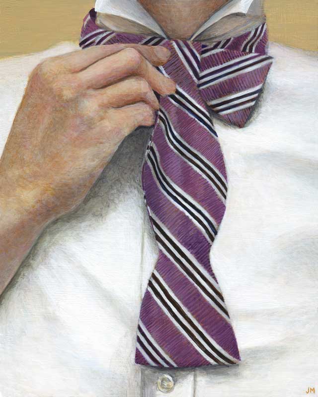
ACRYLIC ON CLAYBORD • 10″ x 8″
Not for sale • prints available; email julie@juliemeridian.com to buy prints ⇢
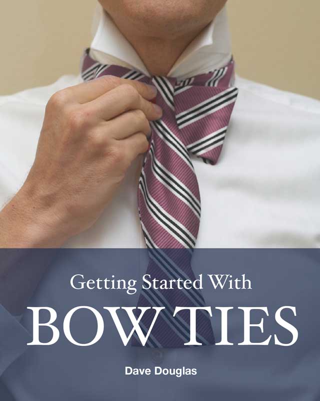
Another collaboration in the Statement series – this one courtesy of my friends Jennifer and Dave. Dave is a connoisseur of bowties and has written an eBook all about them. He had this great photo for the cover, so in exchange for borrowing it for a painting, I created a few layout options for the cover.
The bookcover
What you see here involved a little Photoshop work on the layout and colors. Though I liked this source photo best, it was opposite of the orientation I hoped to use. I flipped the photo and adjusted the orientation of the hand (right hand = no ring) and the shirt placket so they would be accurate. I also shifted the color of the tie from an executive red to a stylish purple. I came up with three cover variants, and they chose the third one.
Go check out the eBook and elevate your bow tie game!


The painting
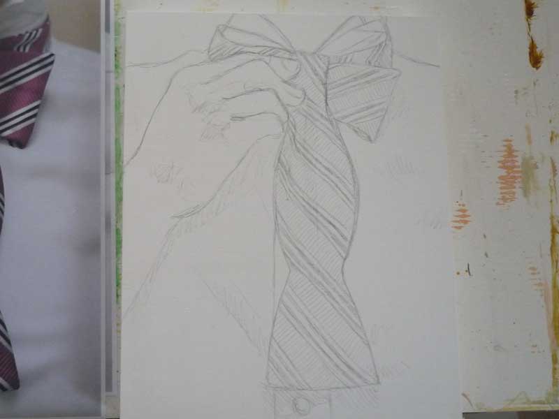
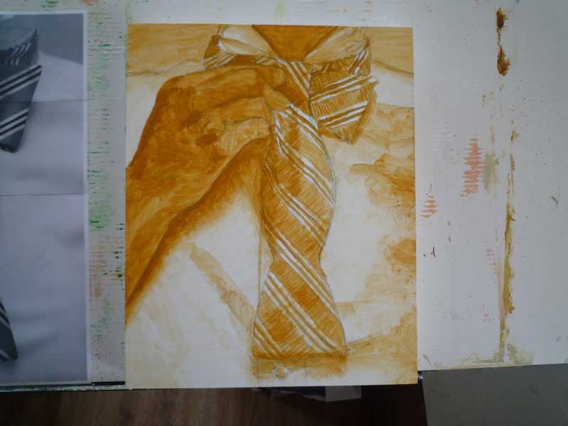
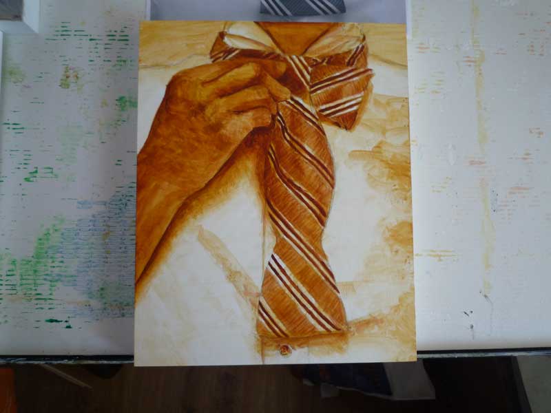
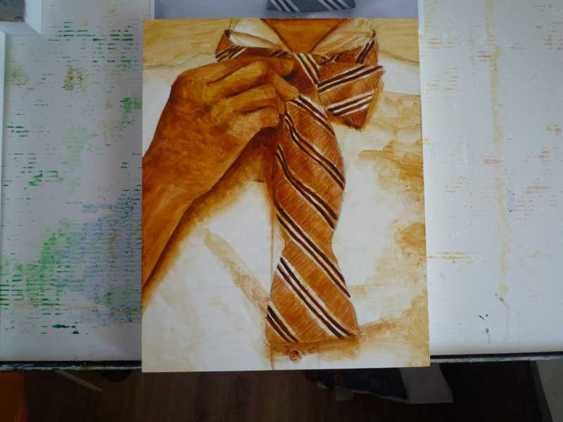
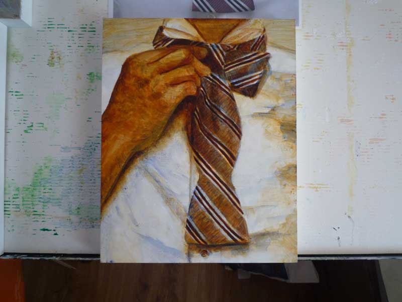
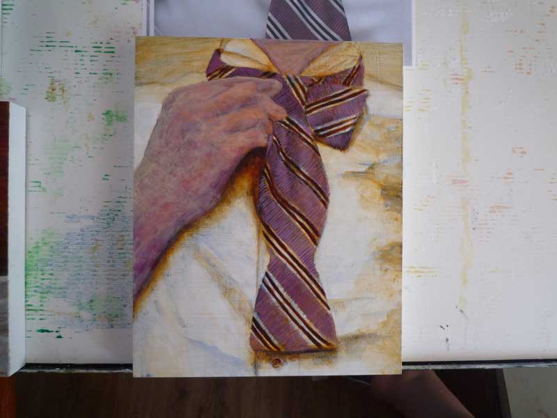
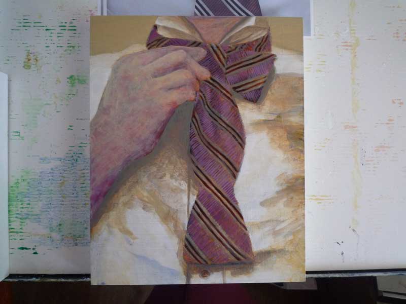
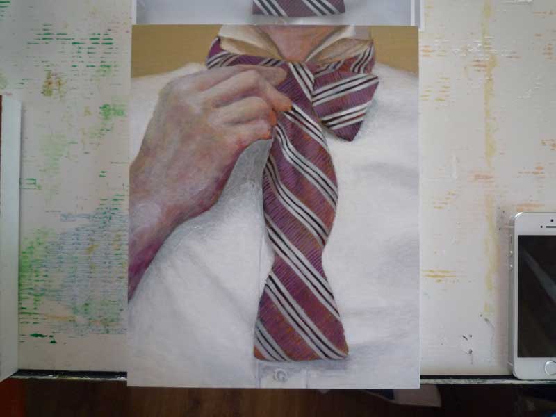
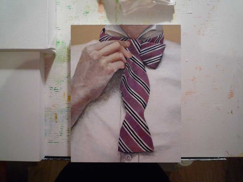
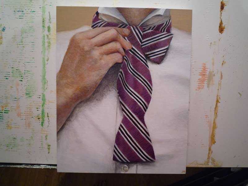
I ran into my classic dilemma with skin tones here. I usually end up skewing them too pale to counterbalance the warmth of the underlying tones. Those are the middle awkward steps.
The texture of the bowtie fabric was particularly fun to paint. Not only did the fabric weave run perpendicular to the stripes, it also had a little bit of a sheen that created some interesting highlights and shadows. One comment I got upon showing this to a friend: “I just want to run my fingernails across it!”

Leave a Reply