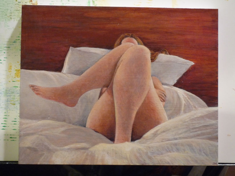
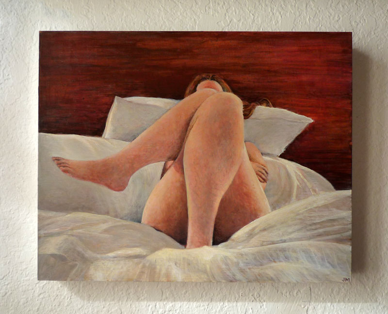
ACRYLIC ON CLAYBORD • 10″ x 8″
Not for sale • prints available; email julie@juliemeridian.com to buy prints ⇢
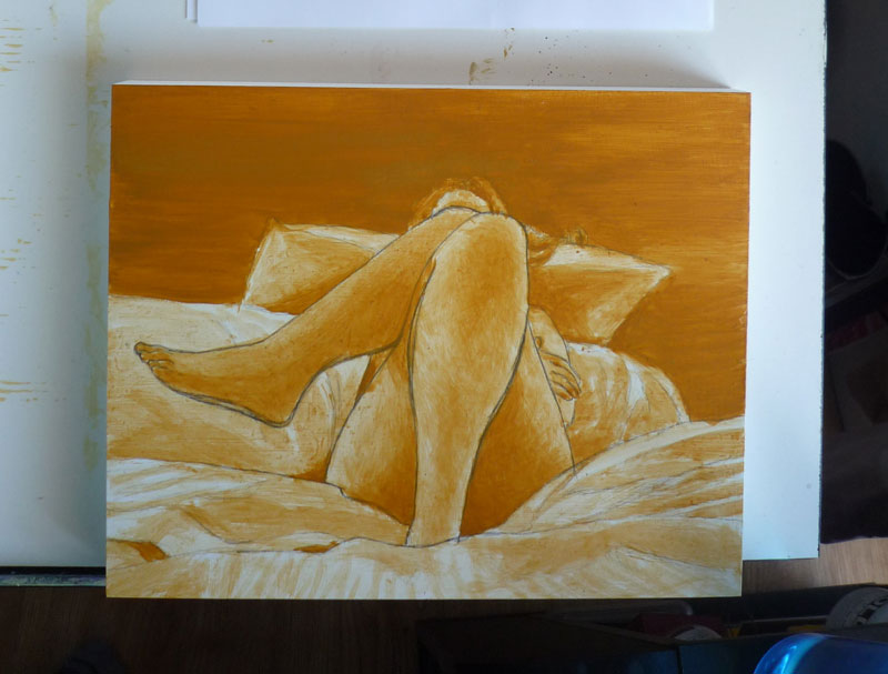
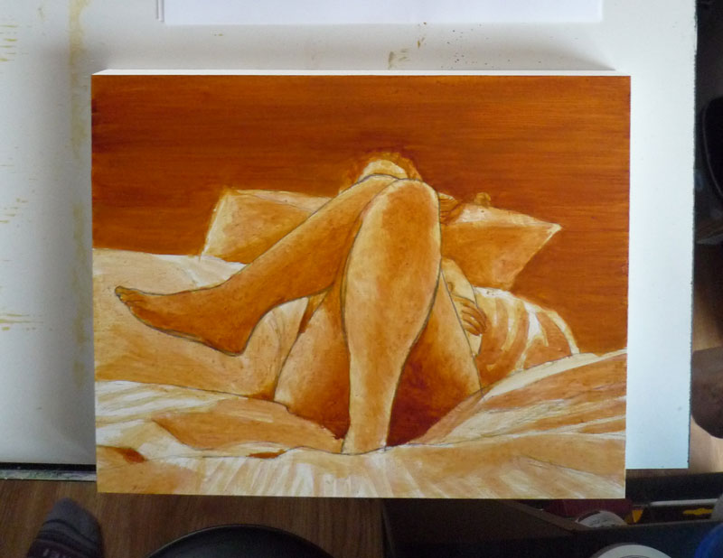
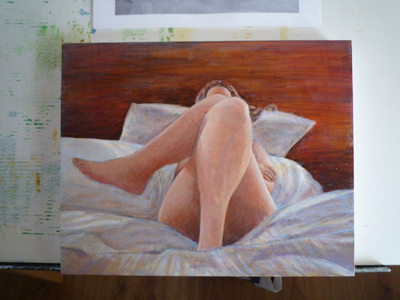
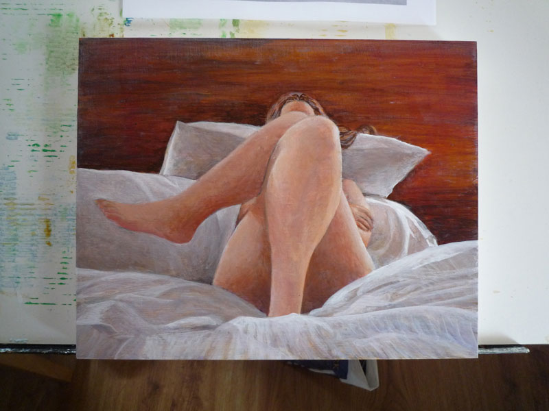
Another figure & fabric Statement exploration, this time where the drape of fabric comes from the surroundings. This pose presented some fresh challenges that can be hidden in drapey clothing: how to capture its natural balance and ease, and getting the right colors and tones in the shadows.
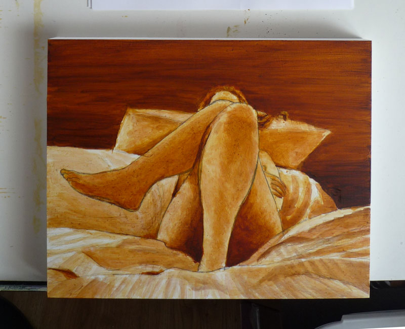
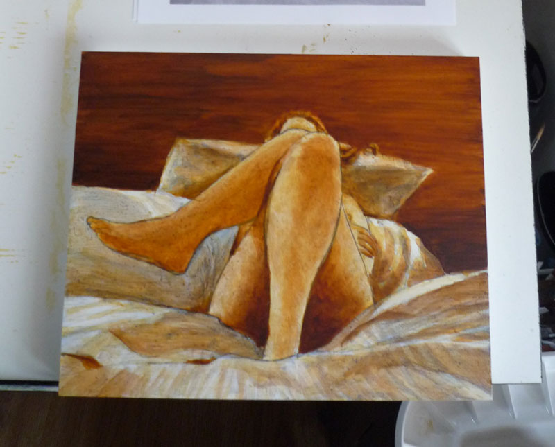
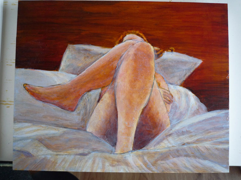
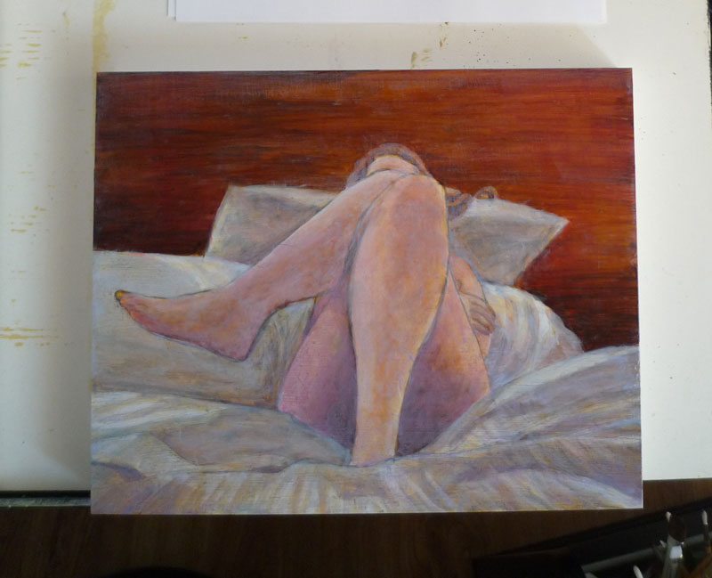
The sheets had a nice subtle damask stripe which was very handy for defining the shapes. When I first started into the shadows, I used a consistent gray until I noticed little patches of other colors. I realized there were two light sources: a prominent yellowish light (probably a ceiling light), and a much lighter bluish source (probably from a window). Separating these helped create more realistic lighting on the sheets and pillows. The wood was awfully close to the base burnt sienna color (with streaks of burnt umber), so the background was quite easy to clean up along the way.
My “despair” moment on this piece was making the error of using washes to lighten up the figure. It sucked out all of the color, and I ended up repainting over almost all of it. However, in the process of that, I came up with a stippling dry brush style that created a nice texture. I also found it better to gradually move towards progressively darker (or lighter) colors and mixing them as I went.
I think my first instinct when painting is to gravitate towards watercolor-style effects, but they just don’t work as well in acrylic on this fast-drying claybord. The drawing-style effects like stippling or hatching turn out better. The dry-brushing is pretty hard on the brushes, but if it looks good, it’s worth chewing up a brush or two along the way. I’ll just be sure to get the cheap ones.

Leave a Reply